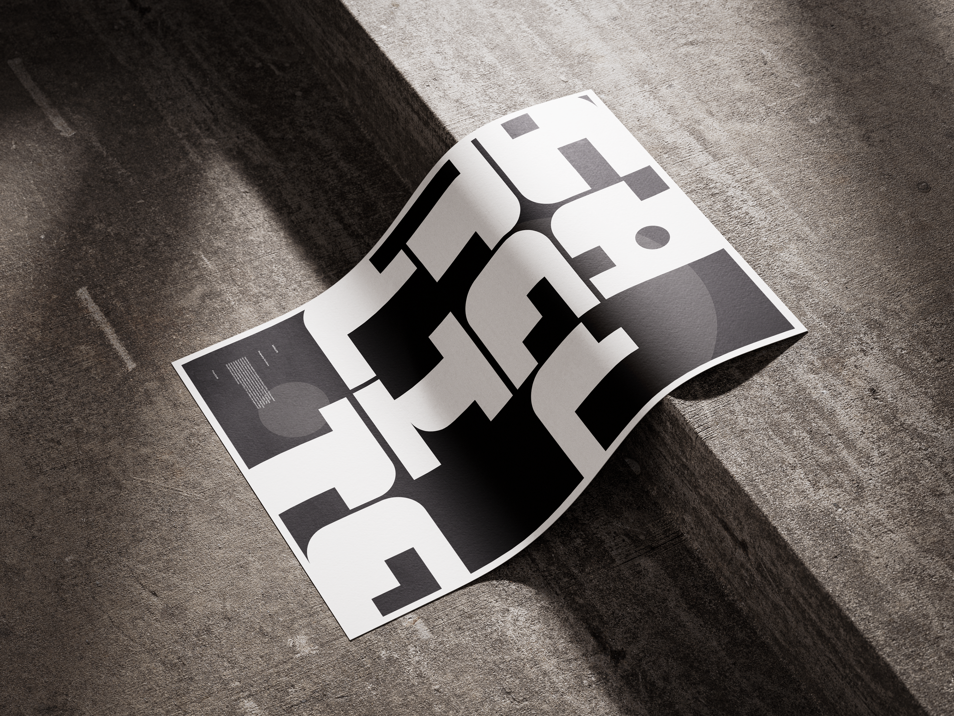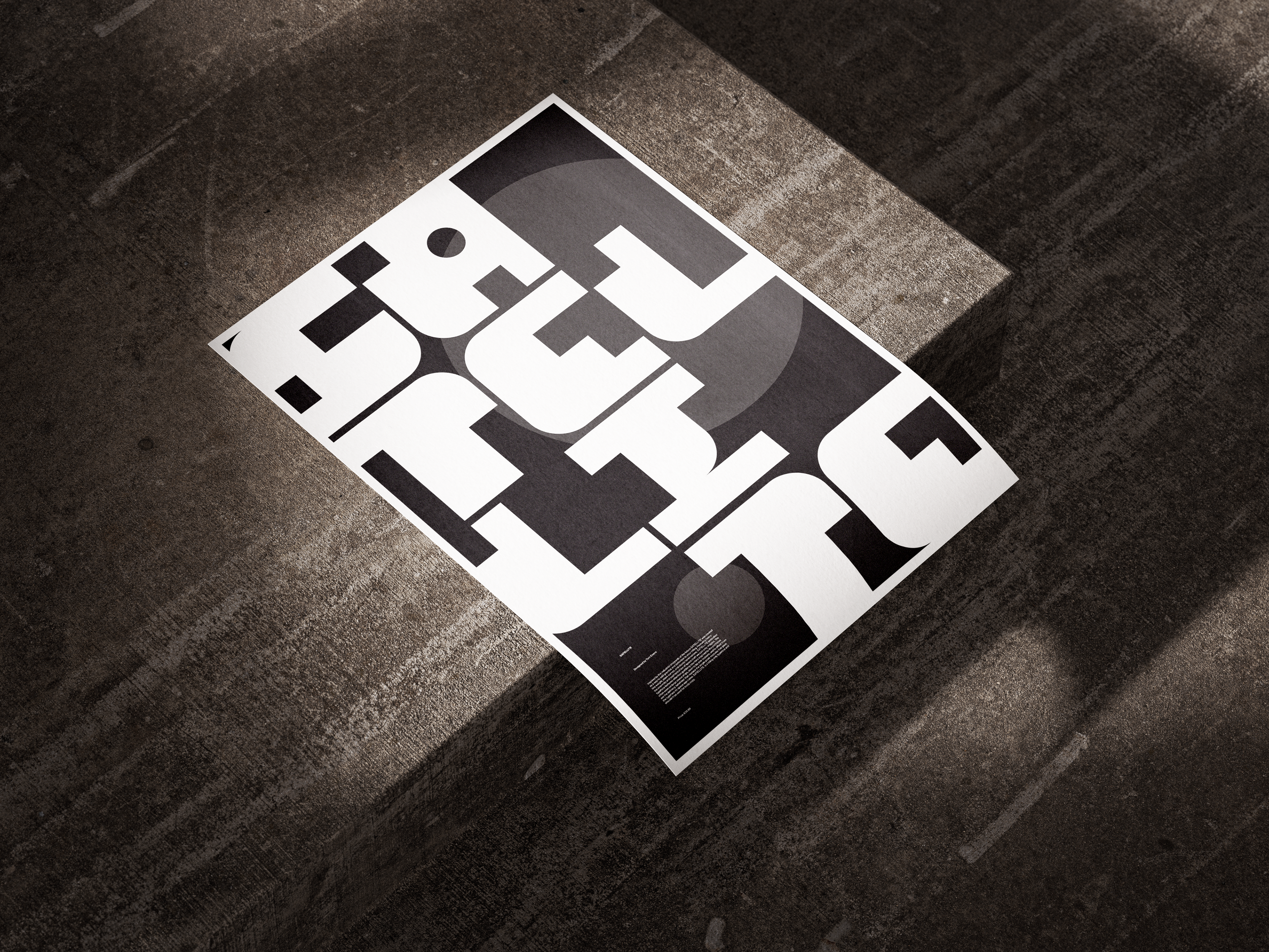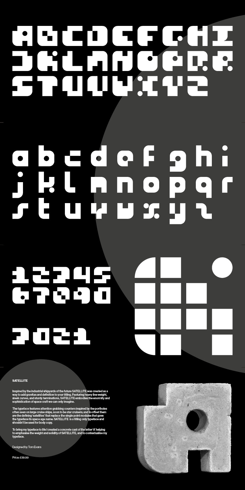
Inspired by the industrial shipyards of the future SATELLITE was created as a way to add gravitas and definition to your titling. Featuring heavy line weight, sleek curves, and sturdy terminations, SATELLITE embodies the enormity and sophistication of space craft we can only imagine.
The typeface features attention grabbing counters inspired by the portholes often seen on large cruise ships, soon to be star cruisers; and to offset them are the defining ‘satellites’ that replace the single point modules that gave the typeface its space age name. SATELLITE is a titling only typeface and shouldn’t be used for body copy.
To bring my typeface to life I created a concrete cast of the letter ‘A’ helping to emphasise the weight and solidity of SATELLITE, and to contextualise my typeface.